


What Makes a Postcard in Palm Beach County Stand Out?
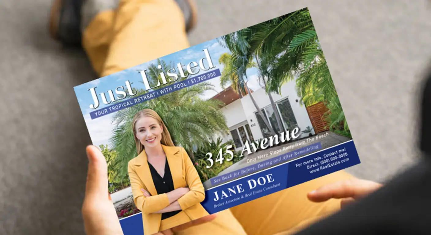
Most businesses think postcards are just about mailing something out. Print it, address it, drop it in the box. But your audience sees more than that — and if you're not designing for their attention, you're asking for the trash bin. Postcards may not cost much per unit, but they leave an impression on your brand. Especially if you're trying to break through in a market as saturated as Palm Beach County.
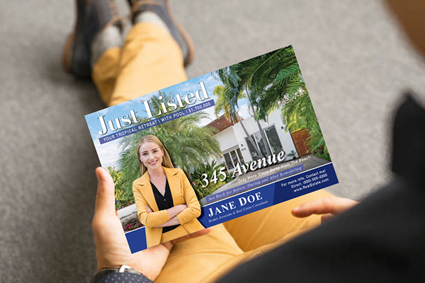
So here's the reality. If you're sending direct mail to build real engagement, that's smart. Just don't treat those pieces like throwaway flyers. Every design choice should serve a purpose. Every word needs to earn its space. And every mailing decision should be grounded in what grabs eyes — not just what looks fine on your screen.
When Color Matters More Than You Think
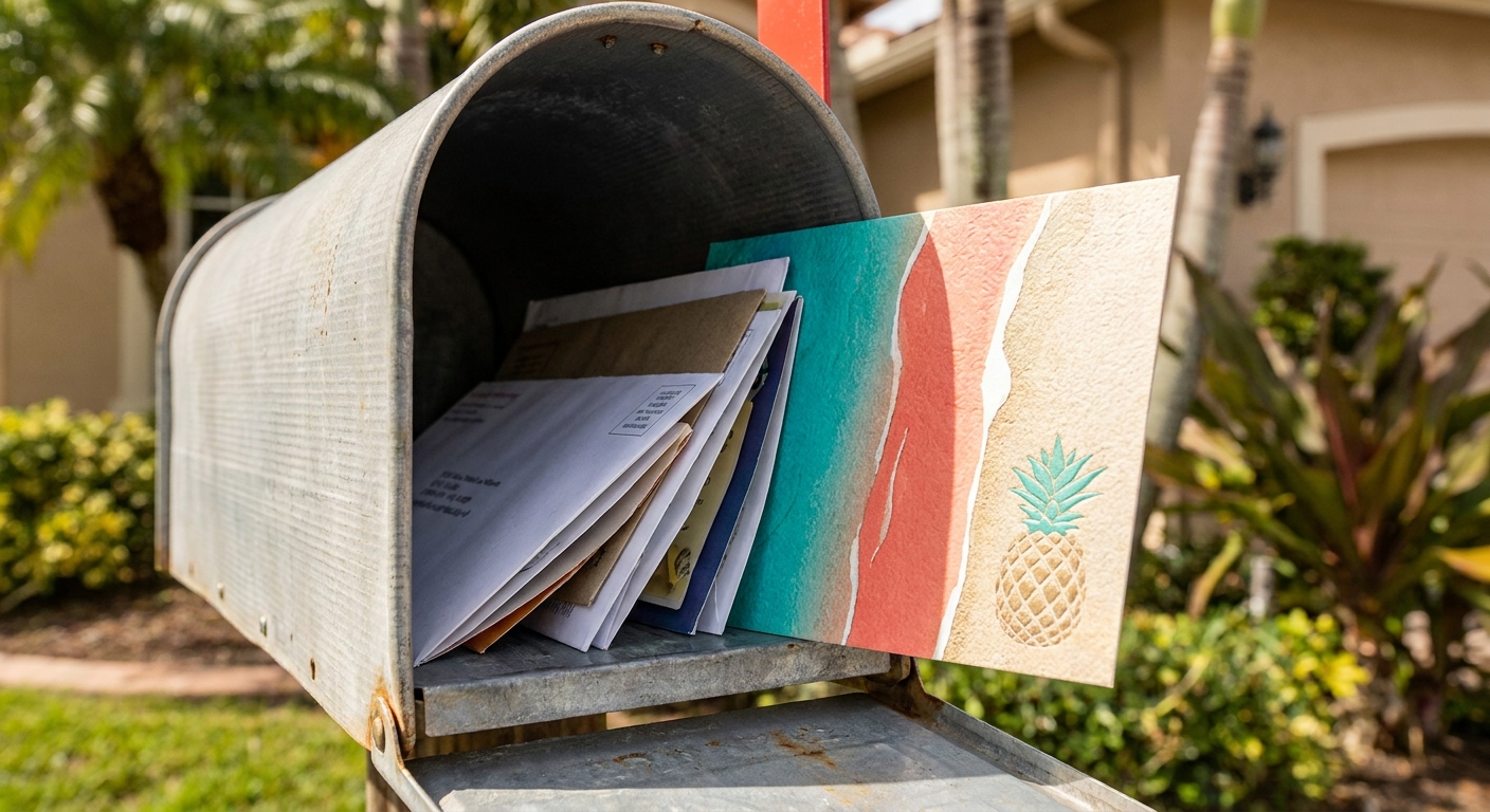
Palm Beach County mailboxes see everything. Real estate pitches, salon promos, lawn care offers. If your postcard looks like every other piece in the stack, it's gone before the front door closes. The envelope might be dead, but that doesn't mean your design gets a free pass.
Bright colors work when they match the vibe. Think coastal tones that mirror the local scenery — ocean blues, coral pinks, sand neutrals. But don't just pick colors because they're pretty. They need contrast. A washed-out background with light text is invisible. Sharp contrast between your message and the backdrop makes reading effortless. And if your image quality is grainy or pixelated, you've already lost credibility before anyone reads a word.
Speak Their Language or Get Ignored
Generic copy is wallpaper. We've all seen it. "Your Trusted Local Business" or "Quality Service You Can Count On." Those phrases say nothing, and residents in Palm Beach County have seen them a thousand times. If your postcard could work in any city, it's not tailored enough.
Reference something real. Mention a neighborhood by name. Call out a local event or landmark. Use language that signals you actually understand who's holding the card. A pest control company might reference "keeping West Palm homes termite-free before rainy season hits." A fitness studio could highlight "boutique classes near the Intracoastal." The more specific you get, the harder it is to ignore.
Cheap Cardstock Feels Cheap
You can design the best postcard in the world, but if it feels flimsy in someone's hand, the message won't land. Palm Beach County skews affluent in many zip codes, and people notice quality — or the lack of it. Thin, bendable stock screams budget mailer. Thick cardstock with a smooth finish says you're serious.
Texture matters too. Matte finishes can feel elegant and understated. Glossy coatings pop visually and resist smudging. Some businesses go further with spot UV or raised printing to add a tactile element. It's not about being fancy for the sake of it. It's about making your piece feel worth keeping, even if just for a few extra seconds.
Your Headline Has One Job
Most postcards fail right at the top. The headline either says too much or says nothing at all. You've got maybe three seconds before someone decides whether to keep reading or toss it. That's not enough time for clever wordplay or vague promises.
Your headline should make the benefit obvious. Not "We're Here for You" — that's noise. Try "New Patients Get a Free Cleaning This Month" or "Sell Your Home Faster with Local Market Expertise." Action-driven language works because it tells people what they get and what to do next. Pair that with a clear call to action — a phone number, a web address, a scannable code — and you've given them a next step that doesn't require guesswork.
Standard Rectangles Blend In
If every postcard in the mailbox is 6x9 and rectangular, yours will be too — unless you change the shape. Oversized postcards stand taller in the stack. Die-cut edges catch the eye. Folded formats add an element of surprise when someone opens them.
Just know the trade-offs. Unusual sizes can trigger higher postage rates, and some shapes won't automate well through postal sorting. Check USPS guidelines before you print a thousand custom-cut pieces that cost twice as much to mail. But when done right, a non-standard format makes your message impossible to miss.
Every Word Should Pull Weight
You don't have room for filler. A postcard isn't a brochure. It's not a website. You've got a few square inches to communicate value, and every sentence needs to count. Long paragraphs lose people. Bullet points keep things scannable.
Here's what your copy should hit:
- The main benefit or offer upfront
- Why it matters to the recipient specifically
- A clear next step with contact info
- A deadline or urgency element if applicable
Don't bury your phone number in tiny type at the bottom. Don't assume people will hunt for your website. Make it obvious. Make it easy. And cut anything that doesn't directly serve those goals.
When Print Meets Digital
Postcards don't have to live in a vacuum. A QR code can bridge the gap between what someone holds and what they do next. Scanning a code takes less effort than typing a URL, and it tracks engagement in ways a printed piece alone can't.
In Palm Beach County, where smartphone adoption is high, this isn't a gimmick — it's an expectation. Link the code to a landing page with more details, a video walkthrough, or a limited-time promotion. Just make sure the destination loads fast and works on mobile. A broken link or a clunky mobile site will undo any goodwill your postcard built.
Timing Isn't Just About When You Mail
Sending a postcard at the right time can double its effectiveness. Mailing a pool service offer in February when nobody's thinking about their backyard? Wasted. Dropping a tax prep promo in early March when people are scrambling? Smart.
Frequency matters too. One postcard might register as noise. A consistent series builds recognition. People need to see your message multiple times before they act. Plan a sequence — not a single shot. And if you're timing around local events, holidays, or seasonal shifts, you're leveraging context that makes your offer feel timely instead of random.
What Separates a Keeper from a Toss
Palm Beach County mailboxes are competitive real estate. Your postcard isn't just fighting other mailers — it's fighting indifference. The pieces that win do more than look good. They speak directly to the recipient, they feel substantial, and they make the next step obvious.
Design with intention. Write with clarity. Print with quality. And treat every mailing like it's the only shot you'll get — because most of the time, it is. Whether you're working with print finishes for postcards, planning design ideas for Palm Beach postcards, or implementing postcard marketing strategies, or exploring print marketing services, the fundamentals remain the same: make it matter, make it memorable, and make the next step easy.
Ready to Make Your Postcards Unmissable?
We know what it takes to help your business stand out in Palm Beach County mailboxes. Let’s work together to create postcards that get noticed, get kept, and get results. If you’re ready to elevate your next campaign, call us at 561-200-9412 or request an estimate and let’s make your message the one they remember.
See Our Work