


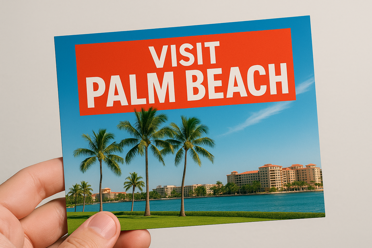
Design Ideas That Help Palm Beach Postcards Get Noticed

Most postcards in Palm Beach never get a second glance. The ones that do have a headline that grabs attention right away. It’s not about clever wording or fancy fonts. It’s about being bold, clear, and impossible to miss. When we design postcards, we make sure the headline is the first thing your audience sees.
- Place the headline at the very top or dead center. Never let it drift to the bottom or hide in a corner.
- Use a font size that dwarfs the rest. The headline should shout, not whisper.
- Keep it short. Five words or less. Every extra word weakens the punch.
- Pair the headline with a bold color block or a graphic that draws the eye.
- Make sure the headline matches the offer. No clever riddles. No vague promises. Just clarity.
A strong headline sets the tone for everything else. It anchors the layout. It tells the reader where to look first. When the headline stands out, the rest of the postcard gets a fighting chance.
Color and Texture That Demand a Second Look
Palm Beach doesn’t do bland. The sun, the art, the storefronts—everything pops. A postcard that blends in with the rest gets tossed. The ones that get kept use color and texture to stand out, even in a stack of mail. Our postcard printing service offers a range of premium finishes and rich inks to help your message shine.
- Pick colors that clash in the right way. Dark on light, light on dark. No muddy blends.
- Accent colors highlight the offer or the call to action. A red button. A yellow banner. Something that says, “Look here.”
- Paper finish matters. Matte feels modern. Glossy catches the light. Textured stocks feel expensive and get fingers to linger.
- Test the design in real sunlight. Palm Beach mailboxes get plenty of it. Colors that look good indoors can fade outside.
A postcard with the right color and texture feels different. People notice. They pause. Sometimes they even keep it on the counter instead of tossing it in the bin. That’s the goal.
Visual Hierarchy That Guides the Eye
People don’t read postcards. They scan. The best designs guide the eye from headline to offer to contact info. No uncertainty, no confusion. Every element has a job, and nothing gets in the way.
- Headlines get the biggest font. Subheads go medium. Details stay small.
- Stick to one or two fonts. No scripts. No hard-to-read styles. If it takes effort to read, it gets skipped.
- Use bullet points or icons to break up information. Big blocks of text get ignored.
- Leave space between sections. Crowded layouts feel cheap and get tossed.
- Highlight the call to action with a different color, a shape, or a border. Make it impossible to miss.
A clear visual hierarchy means the reader knows exactly where to look next. The offer jumps out. The contact info is easy to find. No one has to hunt for the important details.
Brand Consistency That Builds Recognition
Every postcard is a brand builder. Consistency isn’t just about looking good. It’s about being remembered. When the same colors, logos, and style show up again and again, people start to recognize you before they even read a word.
Keep the logo in the same spot every time. Use the same color palette as your other marketing. Don’t switch fonts or layouts just to be different. Familiarity builds trust. In Palm Beach, where competition is fierce, a consistent look sets you apart.
A memorable layout helps too. People remember a postcard that’s easy to follow and fun to look at. When the design feels like it belongs to your business, it becomes more than just a piece of mail. It becomes a mini billboard. For more inspiration, see design tips for eye-catching postcards that work in real mailboxes.
Direct Mail That Gets Results in South Florida
Direct mail in South Florida isn’t about flooding neighborhoods with generic cards. It’s about sending postcards that get picked up, read, and acted on. The best designs use proven strategies: clear offers, bold visuals, and layouts that make the next step obvious. At LeaderInPrint, we help you craft postcards that are customized for your audience and your goals.
- Every postcard needs a single, clear call to action. No confusion. No clutter.
- Contact info should be easy to find. Phone, website, or address—never buried in fine print.
- Use images that fit the local vibe. Palm trees, beaches, or local landmarks connect with people instantly.
- Test different layouts. What works in Miami might flop in Palm Beach. Local tweaks matter.
Custom postcards that fit your brand and your goals get better results. For more on what works, check out our EDDM marketing service for targeted campaigns, or explore our business printing services for more ways to get your message out.
Ready for postcard printing in Palm Beach?
If you want your next postcard campaign to stand out in Palm Beach, we’re here to help. Call LeaderInPrint at 561-200-9412 or contact us to get started with custom postcard printing, creative layouts, and print marketing that gets results.
See Our Work